I didn’t know exactly how I want the brand to represent this warm fuzzy feeling I have, when I think of my friends, but at least I knew what I didn’t want - an alarm clock. They just make us feel bad about how late we slept last night.
But I like mornings. The first ray of sunshine that scans my face, the first breeze from walking outside, they make me feel alive. I live for these moments. Alarm clock is just a bad way to wake up - I haven’t found a better way, someone please invent one.
The point is - I don’t want BetterFriend to feel like alarm clocks.
I want the experience to reflect these words:
Warm, Fuzzy, Friendly, Kind, Fun
References
For the sake of time, I wanted to try to get to a prototype quickly. I looked for reference logos that I liked in my memory, logos that I’ve made before, and colors that represented the things that I wanted.
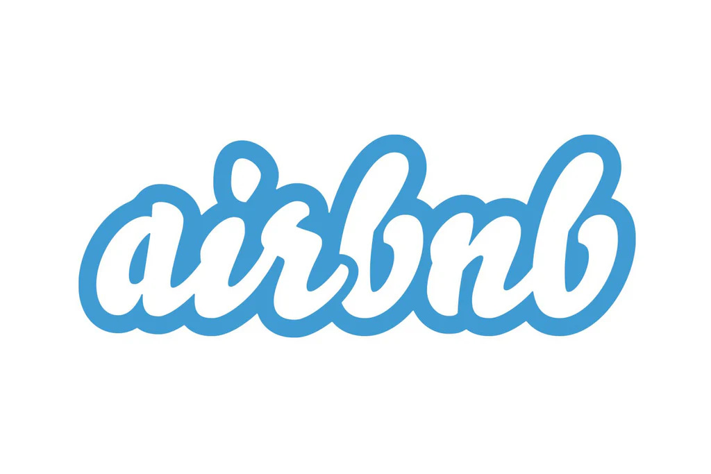
My mind went straight here: Old Airbnb Logo:
I was in college when Airbnb was founded and I remember clearly the 2010-2012 logo was very unique looking. The fade of the white, the font, the blue color. They were all representing some levels of trust and comfort that they desperately needed. The guests need to feel “good” when they book a stranger’s living room.
It was still creepy to stay at someone’s home back then, and the logo I thought made it less creepy.
So I went ahead and asked ChatGPT with this prompt:
”what font is this”
and it shot back:
”The font in the image you uploaded is very similar to Lobster, a popular cursive script font known for its bold, friendly, and connected lettering. It has been widely used in logos and branding, particularly during the early 2010s.
However, Airbnb's old logo, which this resembles, used a custom-designed script — not exactly Lobster, but highly inspired by it or other rounded brush fonts like:
Pacifico
Mission Script
Lobster Two
If you're trying to recreate a similar look for your "BetterFriend" logo, using Lobster or Pacifico would get you very close. Would you like me to apply this style to the logo?”
Amazing.
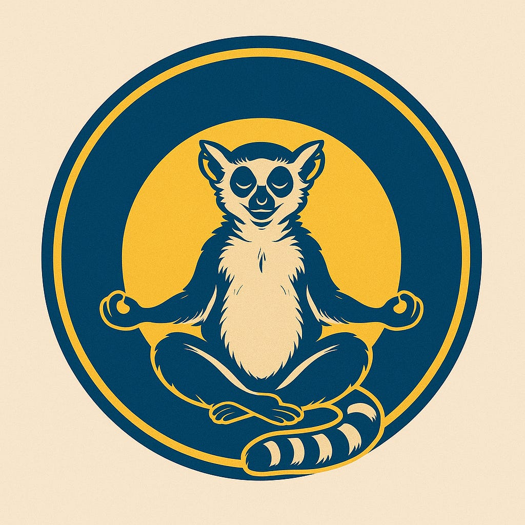
Then I remember, 3 months ago, I created a logo that I liked a lot. I will probably use it in the future on another project, but specifically I like the style of it. I don’t have the original prompt that I used to create it. so I asked ChatGPT to tell me.
”can you tell me what prompt was used for this:”
”The image shows a stylized, graphic illustration of a ring-tailed lemur in a meditative pose, sitting cross-legged with its hands in a mudra gesture. The design has a bold, simplified color scheme with navy blue, gold, and cream, and is enclosed in a circular frame — almost like a logo or emblem.
While I can’t know the exact prompt used, here’s a likely prompt that could have generated something like this:
"A stylized vector illustration of a ring-tailed lemur meditating in lotus position, arms resting with hands in a mudra pose, centered in a circular logo design. Bold color palette of navy blue, gold, and cream. Minimalist, graphic style, symmetrical composition."
Let me know if you want variations (e.g., more realistic, cartoonish, tribal, etc.) or if you'd like me to generate a few prompt variants for specific styles or themes.”
COOL!
I changed a few words:
Create this logo for me:
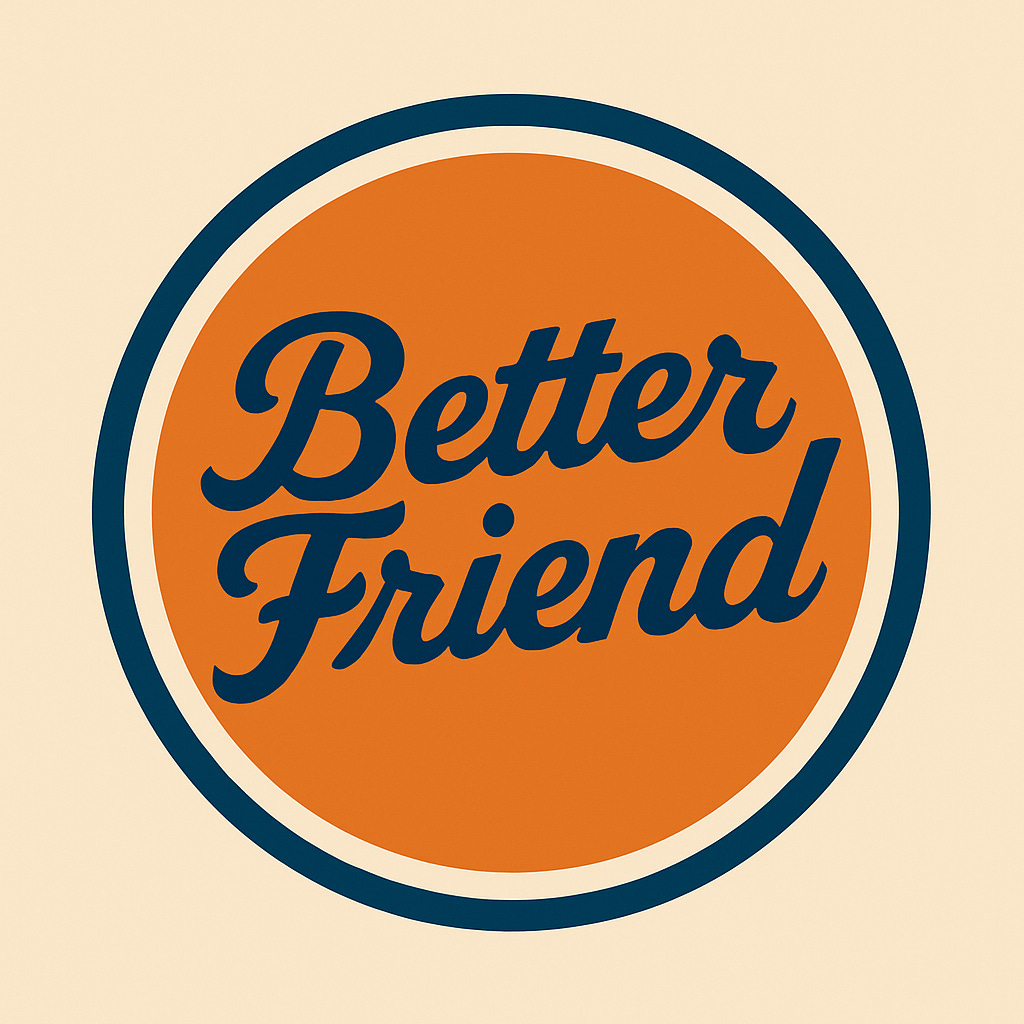
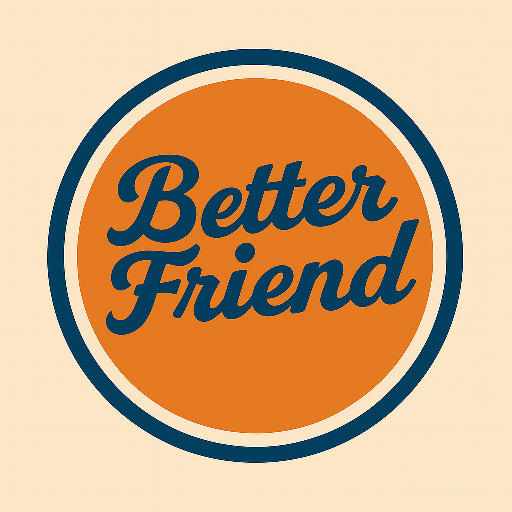
"A stylized vector illustration of a letters "BetterFriend" in cursive, centered in a circular logo design. Bold color palette of blue, orange, and black. Minimalist, graphic style, symmetrical composition.”
The second one here is with airbnb’s closest font: Lobster
I need this to be mainly used as a Whatsapp chat icon (I’ll explain tomorrow). So I shrank them down to mini-size:
Ultimately, the first one won out. The dark blue creates better contrast.
I’m quite happy with this v1.0 logo - it gives me a bit of a family-owned old New York Diner feel. Feels homey, comfortable and human.
If my favorite diner “mom” texted me to say happy birthday to my friends, it’d make my day better.
What did we just do?
Well, we just defined the sentiment we want and we don’t want from the brand
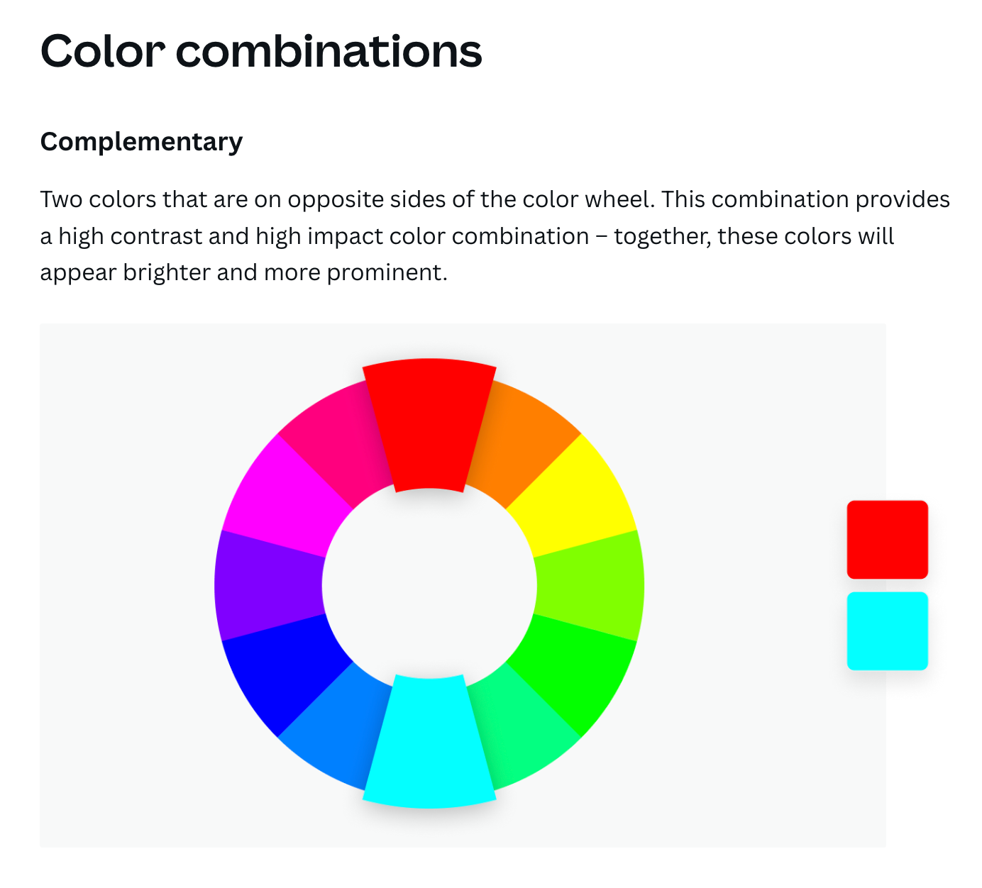
We chose contrasting colors for the font and background using the color wheel
We used ChatGPT to reverse engineer to find the font from an old logo (airbnb)
We used ChatGPT to reverse engineer a logo that I liked (can do with any logo)
We then instructed AI to create it with the color that we want, in the style that we like, and even modified it with the font that we found from another logo
It certainly doesn’t replace a professional full brand designer but with low budget and short on time for v1.0, anyone can follow these steps and get started. ?